Sales Volume Statistics
2021 Monthly Sales versus 2020
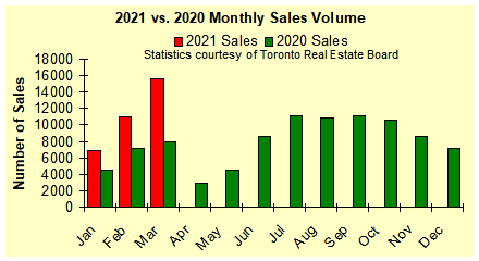
The Toronto Real Estate Board reported a record setting 15,651 sales of single family homes in March 2021. This represents a 43 percent increase over the sales volume reported for February 2021 plus a stunning 97 percent increase over the sales volume reported for March 2020.
Annual Sales Volume 1980-2020
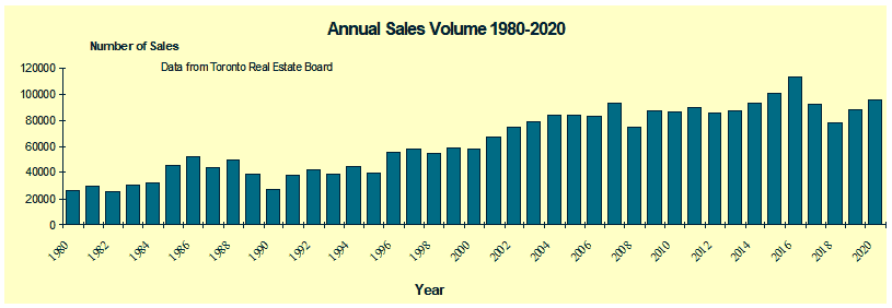
This chart graphically depicts the number of single family homes sold
in the years 1980 through to 2020. The volume of sales in the Toronto area experienced peaks in 1986 and 1988 followed by slow years during the early 1990's. Sales volume picked up from 1996 onwards. Sales of resale homes in 2016 were the highest recorded. Total sales volume in 2018 declined by approximately 31.5 percent from the high of 2016, and was 16.1 lower than 2017. Total sales volume in 2020 was approximately 8.4 percent higher then 2019.
[Note: the Toronto Real Estate
Board's geographic boundaries were changed during the period depicted in
the graph, so direct comparisons between 1996 and 1986 for example, are not valid]
Sales Year-To-Date
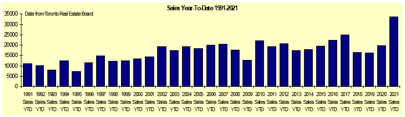
This chart depicts the number of resale homes sold to the end of March for each of the years 1991 through to 2021. 2021 sales volume year-to-date was 70 percent higher then 2020 as well as being the highest on record.
Average Selling Prices
Average Selling Price 1980-2020
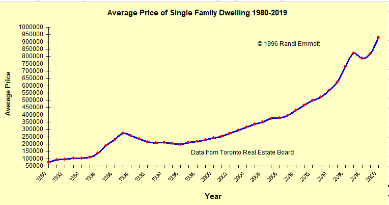
This chart presents average price trends for houses in the Toronto area during the last 40 years. House prices clearly peaked in 1989 and then dropped until 1996. House prices have been steadily increasing since then. Prices levelled off during 2008, but resumed their upward climb in 2009, climbing steeply in 2016 and 2017. Prices declined by 4.3 percent in 2018 but rebounded 4 percent in 2019 and 13.5 percent in 2020..
Average Monthly Selling Price 2021 vs 2020
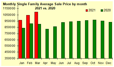
The average selling price of homes that sold during March 2021 was $1,097,565 - which represents a 5 percent increase over the average price reported for February 2021. The March monthly average selling price was also 22 percent higher than the selling price reported for March 2020. Average selling price reported on a monthly basis can be misleading as it is comprised of a combination of the real value of property plus the ratio of higher priced to lower priced homes that have sold during the month. The mix of homes sold during March is depicted below in the Sales by Price Breakdown chart.
The average selling price year-to-date to the end of March 2021 was $1,053,585 - approximately 14.4 percent higher than the average selling price for the full year 2020.
Inventory
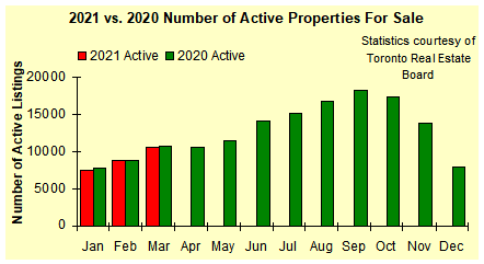
This chart depicts the number of active listings (properties for sale)
on the Toronto Real Estate Board. There were 10,603 properties listed for sale in March 2021 which represents a 20 percent increase over the number of properties listed for sale in February 2021 as well as a 0.7 percent decline from the number of properties listed for sale a year ago in March 2020. The number of new listings coming onto the market in March was 57 percent higher than a year ago.
Home Sales by Type/Price
Home Sales by Type of Property:
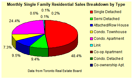
This chart breaks down single family residential sales during March 2021 into the various different categories of property such as single family detached, semi-detached, townhouse etc.
Home Sales by Price Range
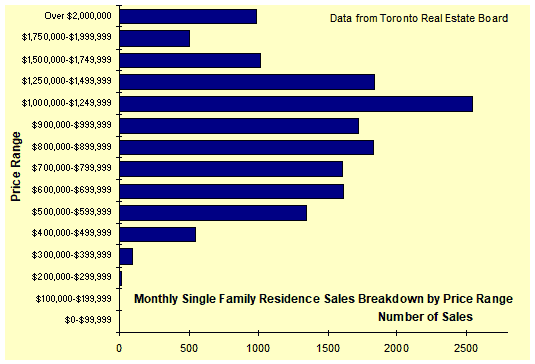
This chart breaks down sales of single family homes during March 2021 into price ranges so that the most popular (highest selling) price ranges can be quickly determined. Sales volumes during March were highest in the $1,000,000 - $1,250,000 price range with sales in the $1,250,000 - $1,500,000 range coming in second. The mix between sales of higher priced homes versus lower priced homes directly affects the average selling price reported for the month.

RE/MAX West Realty Inc.
Tel: (905) 607-2000
E-Mail: remmott@remax.net

RE/MAX West Realty Inc.
Tel: (905) 607-2000
E-Mail: r.emmott@gmail.com